$15–30 / month forever
- Same sweatshirt template as 1,000 other shops
- Centered product on white, reads as catalog
- Subscription that auto-renews every month
- Manual scene swap every shoot
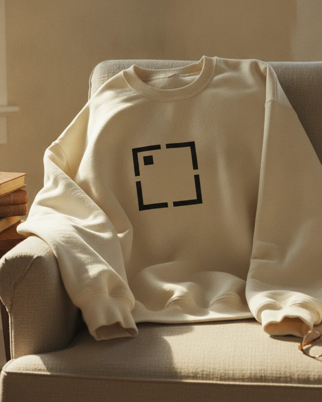
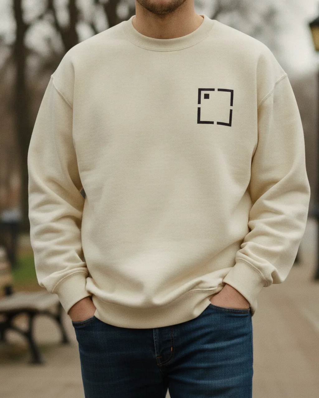
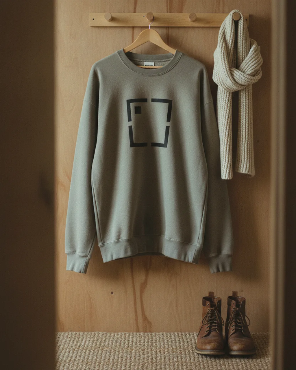
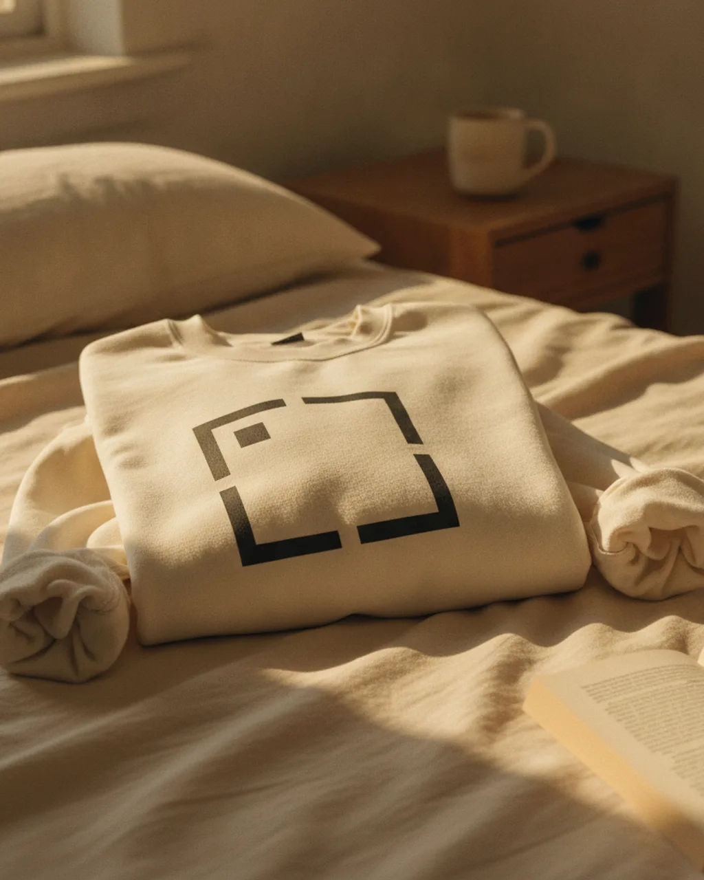
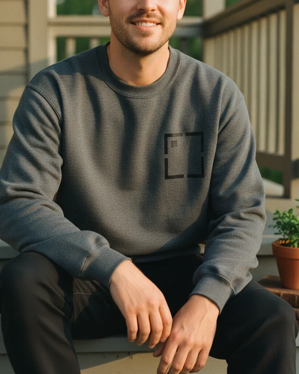
Crewneck sweatshirt photos need weight, ribbing, and soft folds. Hauld renders your design on heavyweight fleece in 5 lifestyle scenes - reading nook, tree-lined street, peg rail, made bed, porch steps - so the listing feels like a small shoot instead of a stock template.
Try free on your sweatshirt design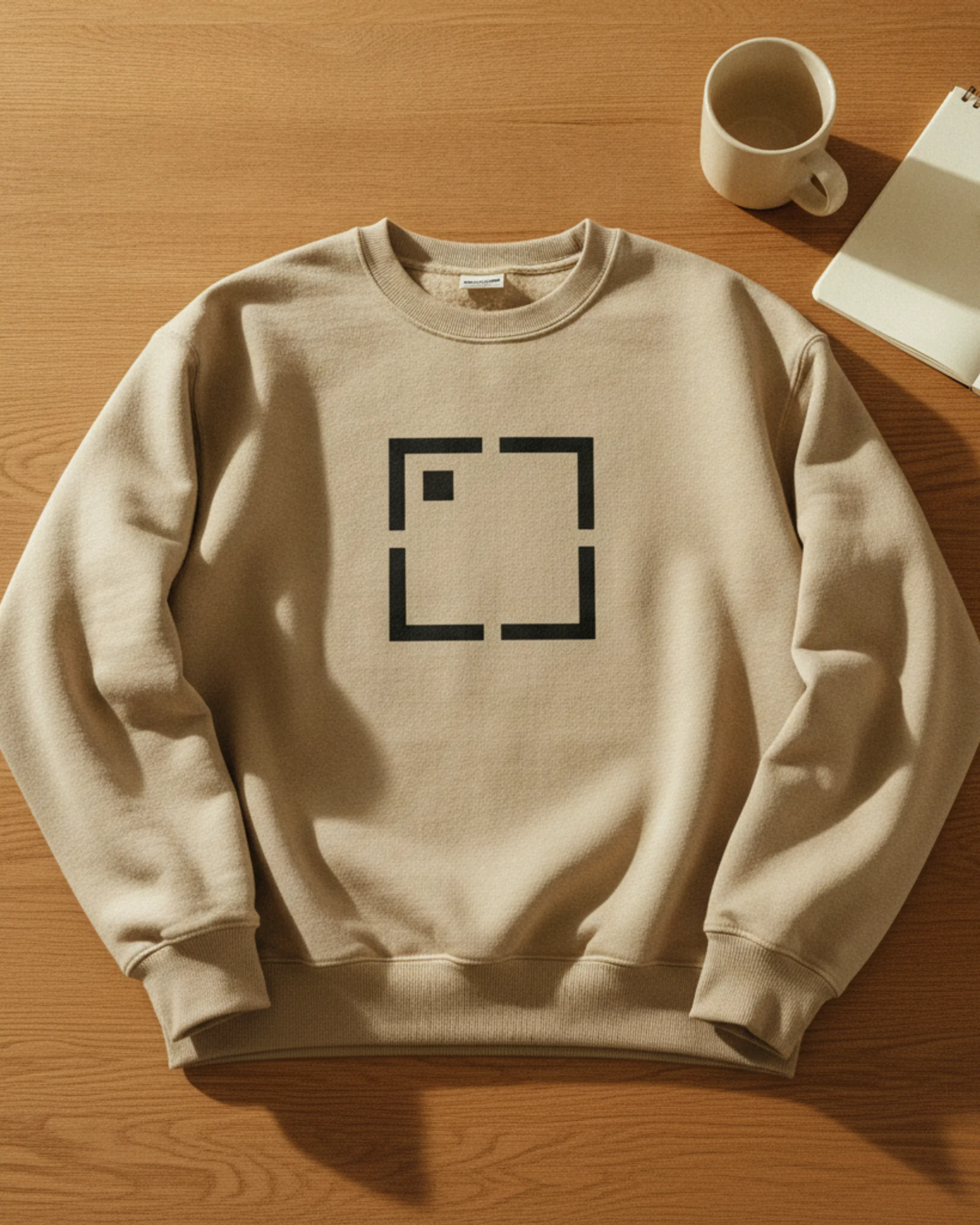
Upload one sweatshirtdesign and Hauld returns 5 lifestyle scenes — cropped, color-graded, ready for your listing carousel. The examples below are real Hauld renders on a sample design.
A sweatshirt is not just a long-sleeve t-shirt. Buyers expect weight, ribbing, structure, and a different kind of comfort. A crewneck needs to look heavy enough to hold folds, soft enough to wear inside, and clean enough that the chest print still feels intentional. A flat template usually collapses all of that into a graphic on a beige shape.
The best sweatshirt photos show the blank doing some of the selling. Ribbed cuffs, a thick collar, and a relaxed hem tell the buyer what kind of garment they are getting before they read a material line. Scenes like a reading nook, a peg rail by the door, or porch steps place the sweatshirt in normal life instead of making it feel like a catalog sample.
That is useful for print-on-demand shops because many sellers use similar blanks. The design differentiates the product, but the photography makes it feel like a brand.
Hoodie mockups can lean on the hood, drawstrings, and pouch pocket for visual interest. Crewneck sweatshirts do not have those shortcuts, so the fabric and print placement have to carry more of the frame. The collar rib, sleeve volume, and hem shape are the cues that make the product read correctly.
Hauld prompts the sweatshirt as heavyweight cotton-fleece with visible ribbed cuffs and hem. That matters because a printed design should not float over the garment. It should catch light on the raised weave, soften through chest folds, and stay flat only where the fabric itself is flat. If the shirt is draped over a chair, the print needs to bend with the fabric. If it is folded on a bed, the design should compress naturally across the fold.
This is also why a sweatshirt page deserves its own images instead of reusing hoodie shots. Similar product category, different buyer expectation, different physical cues.
Start with the image that makes the sweatshirt feel most wearable. For some designs that is the flatlay hero on oak, where the print is clean and readable. For softer lifestyle brands, the porch or reading-nook frame may be stronger because it sells the comfort first. The goal is not to show every angle equally; it is to order the carousel around the buyer's decision.
Keep one detail-forward image in the set so people can inspect the graphic and fabric. Then let the remaining scenes answer context: how it looks worn, how it sits folded, how it hangs near other cold-weather pieces. That mix makes the listing feel fuller than a single front mockup repeated in different colors.
Upload a clean front-chest design, avoid pre-warping or adding fake shadows, and let the render handle fleece, folds, and room light. If you sell a stitched or embroidered sweatshirt, include that in the design name so the prompt has a clear material hint.
Yes. Sweatshirt renders use a crewneck shape with ribbed collar, cuffs, and hem, without a hood or pouch pocket.
The prompt asks the model to keep your artwork pixel-faithful while letting the ink catch the raised weave and soften naturally in creases.
The default is a printed chest design. If the artwork name says embroidered patch or stitched design, the pipeline can bias the render toward a raised thread look.